Boxplots (aka Box and Whisker plots) with outliers
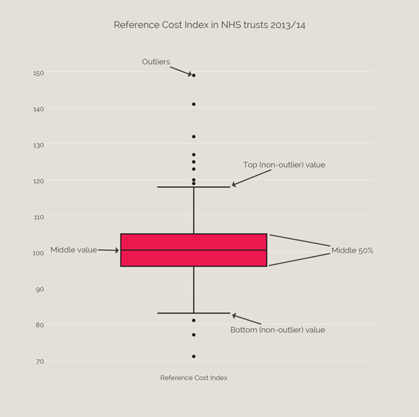
Boxplots are a way of showing variation within a group (and often comparing that to another group). They were introduced by John Tukey in 1969. This one below shows a few key things: outliers, the top and bottom of the range, the middle 50%, and the middle value. Below we can look at an example: the variation in Reference Cost across 244 NHS providers.
Further reading
Work with us
We look for talented and passionate individuals as everyone at the Health Foundation has an important role to play.
View current vacanciesThe Q community
Q is an initiative connecting people with improvement expertise across the UK.
Find out more
