Unfortunately, your browser is too old to work on this website. Please upgrade your browser
Skip to main content

Key points

  • The latest estimates of period life expectancy at birth for the UK show a fall from 2017–19 of as much as 0.7 years for males (to 78.6 years) and 0.4 years for females (to 82.6 years) by 2020–22. This reflects higher than average mortality rates due to the pandemic.
  • In the decade leading up to the COVID-19 pandemic, a long-term trend of improving mortality rates stalled. This is illustrated by a slowdown in period life expectancy gains. If the pre-2012 trend had continued period life expectancy at birth would be 3.3 years higher for males and 2.5 years higher for females in 2022. 
  • Inequalities in life expectancy remain wide and have been entrenched and exacerbated by the pandemic. The gap in life expectancy between the local authorities with the highest and lowest life expectancy was 7.4 years in 2017–19 and it grew to 8.7 years in 2020–22. More-deprived local authorities and local authorities in the north of England tend to have the lowest life expectancy. 
  • Although people born today are still expected to live for longer than older cohorts, they are not expected to live for as long as previously thought. People born in 2020 were expected to live to 93 years in 2010-based projections and are now expected to live to just 89 years in 2020-based projections – lower than in 2002-based projections.
  • The UK’s life expectancy lags behind many other advanced nations leaving plenty of room for improvement. Strategies for a future government to boost life expectancy should include addressing health inequalities to close life expectancy gaps between different areas and ensuring people’s health is maintained through their lifetime by investing in the building blocks of health, including adequate incomes, decent housing and good work. 
 

Introduction

How long people are likely to live – their life expectancy – is commonly used as an indicator of the health of a country and its population. Used in combination with other measures such as GDP, it can help to capture the prosperity of a country now and its future potential, and is an important signal of social progress.

There are different ways to measure life expectancy. Thorough understanding and analysis of these measures gives an insight into how health has changed and is changing across the UK and serves as a reminder of the UK’s long-term life expectancy challenge. Here, we use period life expectancy and cohort life expectancy to look at the latest trends and projections for the UK’s life expectancy, how life expectancy varies across areas, and how inequalities have changed over time.

Life expectancy is a statistical measure of how long, on average, people can expect to live under certain assumptions about mortality rates.

There are two types of measure: period life expectancy and cohort life expectancy.

Period life expectancy is calculated using age-specific mortality rates of a given area and point in time and assuming these will stay the same throughout a person’s life. It reflects the current risk of death and should mainly be used to compare different population groups or periods of time, rather than to estimate the expected lifespan of the current population.

Cohort life expectancy is calculated using a combination of observed and projected mortality rates. Observed mortality rates are used for past years. Projections of mortality are used at future ages for cohorts that are still alive, or yet to be born. Cohort estimates are regarded as a more appropriate measure of how long a person of a given age is expected to live.

Both period life expectancy and cohort life expectancy are often used ‘at birth’ – this represents the average number of years a new-born baby is expected to live under the above respective mortality assumptions.

Period life expectancy is the most appropriate measure to summarise mortality rates in a given year and assess the impacts of one-off events. This is the measure that best demonstrates stalling improvements in life expectancy in the UK over the past decade and the impact of the COVID-19 pandemic. It is also the measure used to compare trends over time and across different geographies. It clearly highlights how in the UK inequalities are wide, entrenched and have been exacerbated during the pandemic. 

Cohort life expectancy is the best indicator of how long people will be expected to live in the future. It is revised every 2 years by the ONS and revisions over time clearly indicate that although people born now are still expected to live for longer than people born in previous years, they are not expected to live for as long as previously thought.


How has life expectancy changed over time and what do the latest estimates show?

Through the 20th century and at the start of the 21st century, period life expectancy at birth increased relatively rapidly, from an average of 46 years in the early 1900s to around 80 years by 2011. This was due to reductions in mortality rates influenced by, for example, improvements in living standards, public health initiatives and infectious disease control.

However, since 2011, improvements in mortality rates have slowed, causing life expectancy gains to stall. In the years between 2011 and 2019, period life expectancy at birth remained at around 79 years for males and 83 years for females. While there has been some debate as to the cause of this slowdown, much of the discussions have focused on individual drivers in isolation, such as the impact of flu, slowing CVD mortality or austerity policies. It is more likely that the slowdown in mortality improvements is the result of a number of factors operating simultaneously across different populations.

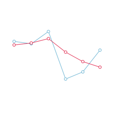
Figure 1 shows trends in period life expectancy at birth since 2000, including the stalling improvements in life expectancy since 2011 and the fall in life expectancy as a result of excess deaths during the COVID-19 pandemic. In 2020–22, period life expectancy at birth was 78.6 years for males and 82.6 years for females. Both are lower than in 2017–19, where period life expectancy was 79.3 years for males and 83.0 years for females. This reduction is likely to be temporary and reflects the higher than average mortality rates experienced due to COVID-19.

The ONS uses 3-year averages as its headline measure, to smooth relatively small year-to year fluctuations caused by events such as a colder than average winter or higher rates of flu – both of which tend to cause higher than average mortality rates. 

Although subject to fluctuations, single-year estimates are helpful to unpick more recent trends, particularly as the impact of the COVID-19 pandemic fades. As Figure 1 shows, after falling sharply in 2020, single-year estimates in 2022 show a return towards pre-pandemic levels, with period life expectancy for males at 79.0 years and for females at 82.9 years.

Figure 1

With the most acute effects of the COVID-19 pandemic on mortality rates largely in the past, the question now is whether the UK can achieve improvements in life expectancy similar to those before 2012 or whether life expectancy improvements will continue stagnating. 

Figure 2 highlights the scale of the challenge. If the pre-2012 trend had continued, life expectancy at birth would be 82.3 years for males and 85.3 years for females – 3.3 years higher for males and 2.5 years higher for females than in 2022.

Figure 2

Although pre-pandemic improvements in mortality slowed down across most comparable countries, the slowdown has been particularly rapid and pronounced in the UK. With a relatively low life expectancy compared with many other OECD countries, there is room for improvement for UK life expectancy. Some of this headroom stems from inequalities in life expectancy across the UK.


What do inequalities in life expectancy across the UK look like?

Looking beyond the headline figures, wide inequalities in life expectancy exist across the UK. 

Figure 3 shows the variation in life expectancy across local authorities and regions in England, Northern Ireland and Wales and how this variation has changed over time. 

Figure 3

A decade before the pandemic, there were already stark geographic inequalities across the UK. The difference between life expectancy at birth in the local authorities within England, Wales and Northern Ireland with the highest and lowest life expectancy was 7.0 years in 2011–13 (NB life expectancy estimates for Scotland are excluded due to data availability – these will follow when rebased population estimates are published, with Scotland 2022 Census data).

Local authorities in the south of England had, on average, the highest life expectancies, and local authorities in the north of England had the lowest. All local authorities in the North East had life expectancies below the average in England, Wales and Northern Ireland.

By 2017–19 these inequalities had widened to a gap of 7.4 years. This was driven by larger improvements in life expectancy in some areas like London – with an improvement of 0.3 years since 2011–13, compared with just 0.1 years across Wales and the East of England.

The pandemic exacerbated this situation: the life expectancy gap between the highest and lowest performing local authorities grew to 8.7 years in 2020–22, with the lowest life expectancy at birth in Blackpool at 76.2 years and the highest in Hart in the South East at 84.9 years. Although all regions saw their life expectancy fall in this period, on average the local authorities in northern regions saw a greater fall in life expectancy than areas in the south. For example, average life expectancy in the North West fell by 0.7 years, compared with a fall of 0.1 in the South West. 

The exception to this north–south trend is London, which saw an overall fall in life expectancy of 0.7 years, with local areas Redbridge and Hackney seeing the worst declines at 1.9 and 1.8 years respectively. This reflects London having witnessed some of the highest COVID-19 mortality rates in 2020, and the highest in 2021

Geographic inequalities exist for male and female life expectancies across England, Northern Ireland and Wales. However, these inequalities have changed over time. In 2017–19 the gap in life expectancy at birth was lower for females at 7.3 years, compared with 8.5 years for males. In 2020–22, the gap widened much further for males to 10.3 years, compared with an increase to 7.5 years for females. This partly reflects higher male mortality rates in the pandemic. 


How does life expectancy vary by deprivation level?

Figure 4 shows variation in life expectancy between local areas based on their level of deprivation. Here we form deciles based on a local authority’s overall level of deprivation. Similar analysis ranking at a smaller area level (such as LSOAs) would be likely to show a greater difference between deprivation deciles – when looking at local authorities, more extreme values are averaged out, making the difference between deprivation deciles smaller. 

Between 2011–13 and 2017–19 improvements in life expectancy slowed down further for the most-deprived areas. 

  • For the 10% most-deprived local authorities, male life expectancy increased by just 0.3 years on average, compared with 0.6 years in the 10% least-deprived local authorities. 
  • The pandemic exacerbated this with male life expectancy in the 10% most-deprived local authorities, decreasing by 1.2 years on average, compared with 0.4 years in the 10% least-deprived local authorities, between 2017–19 and 2020–22. 
  • Inequalities are similarly striking if looking at female life expectancy. Between 2011–13 and 2017–19, female life expectancy increased by just 0.1 years in the 10% most-deprived local authorities, compared with an increase of 0.6 years in the 10% least-deprived local authorities. 
  • Between 2017–19 and 2020–22, female life expectancy fell by 1.0 year in the most-deprived 10% of local authorities, compared with a fall of 0.3 years in the least-deprived. This pattern likely reflects higher mortality rates due to the pandemic in more-deprived areas

Figure 4

Overall, these data show that the inequalities in life expectancy we see today have existed across the UK for a long time and have worsened over the past decade and throughout the pandemic. 


What does future life expectancy look like and how has that changed over time?

Stalling improvements in mortality rates affect not only current life expectancy but also projections of how long people are expected to live in the future. 

Figure 5 shows that cohort life expectancy projections improved up to projections based on 2010 population estimates but have since been revised down. Although future cohorts are still expected to live for longer than previous cohorts, they are not estimated to live as long as previously expected. Under 2010-based projections, life expectancy at birth for people born in 2020 was 91.8 years for males and 95.1 years for females. Under the most recent 2020-based projections life expectancy at birth is now 87.3 years for males and 90.2 years for females.

Cohort life expectancy projections use estimates of future mortality rates based on assumptions about future changes to mortality. These assumptions are reached through consultation with external experts. They are usually produced every 2 years by the ONS as part of their population projections and tend to be revised over time given inherent uncertainty in the assumptions.

Figure 5


What has driven life expectancy improvements in the past and what are the opportunities now?

Improvements in life expectancy occur because a greater share of the population lives to older ages. Figure 6 shows successive improvements in cohort survival rates since the start of the 20th century – while successive generations are living longer, the gains are diminishing. Improvements in survival rates are shown as the curves moving further to the top right of the chart, as larger proportions of the population are surviving to older ages.

The drivers for improvement have been different over time. For cohorts born between 1905 and 1950, improvements in survival rates were due to big gains in infant mortality, driven by public health measures such as childhood immunisations. 

Survival curves show the proportion of people born in a given year (a cohort) who survived or are expected to survive to a certain age. For past years, this is calculated from observed mortality data for that cohort. For future years, survival rates are calculated from projections of mortality rates.

Figure 6

Future opportunities to improve life expectancy lie primarily in reducing health inequalities, as well as continuing to improve mortality rates at older ages.

On health inequalities, while half of the cohort born in 2005 is now expected to live for at least 90 years, compared with 65 years for those born in 1905, there is still wide variation within cohorts. 79% of males expect to live to 65 in most-deprived areas in England and Wales, compared with 91% in the least-deprived areas.

Reducing health inequalities and increasing longevity at older ages is not just about improving health care towards end of life but also means making sure health is maintained through the lifetime by ensuring the building blocks of health are in place – such as decent housing, good work and an adequate income. 


What lies ahead?

In the aftermath of the high mortality rates from the pandemic, the main question is what will happen to life expectancy from here? Will it continue to rise further than pre-pandemic levels, moving towards international counterparts? Will improvements return to the low levels of growth seen in the decade leading up to the pandemic? More importantly, what will happen to inequalities in life expectancy – will the gap close between different areas of the UK? Scrutiny and understanding of these issues has been limited since the COVID-19 pandemic.

We must also remember that, in addition to how long people live, the quality of people’s life – measured through healthy life expectancy – is extremely important. Although we are yet to see the latest data on healthy life expectancy, inequalities in healthy life expectancy are even wider than inequalities in life expectancy. As part of the levelling up agenda, the government has ambitiously committed to improving healthy life expectancy by 5 years by 2035, while narrowing the gap between the areas with the best and worst health.

The current and incoming governments face an uphill challenge in improving UK citizens' health – and life expectancy. Good health and wellbeing are the UK's most precious assets – they enable people to achieve their potential, fuel the economy and help build a stronger society. However, the current cost-of-living crisis and historically weak income growth, pressure on diminished public services and strain on health and care services do not point to sudden future improvements. 

Improving the nation’s health should be a key driver of government policy, with stalling life expectancy to receive the same amount of attention as stalling productivity and wage growth. Improving health needs long-term cross-government action – across the building blocks of health, such as good quality jobs and housing, as well as wider public services.

Further reading

Kjell-bubble-diagramArtboard 101 copy

Get social

Follow us on Twitter
Kjell-bubble-diagramArtboard 101

Work with us

We look for talented and passionate individuals as everyone at the Health Foundation has an important role to play.

View current vacancies
Artboard 101 copy 2

The Q community

Q is an initiative connecting people with improvement expertise across the UK.

Find out more