Key points
-
Successive improvements in cohort survival rates since the start of the 20th century mean that the proportion of males surviving to age 60 has increased: from 59% for people born in 1905 to a projected 94% for people born in 2005.
-
In more recent years, the greatest improvements in survival rates have been at older ages.
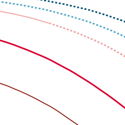
This chart shows the proportion of people from a given year of birth (a cohort) who survived or are expected to survive to a certain age. This is calculated from observed mortality data for that cohort for past years. In contrast, survival rates for future years are calculated from projections of mortality rates.
-
Of people born in 1905, 66% of females and 59% of males would survive to 60 years of age. Throughout the 20th century, big gains in infant mortality and advances in infectious disease control led to improved survival rates, with 91% of females and 87% males from the cohort born in 1955, surviving to age 60.
-
Survival rates at age 60 – and at every age – have improved between each cohort. On the chart, this has the effect of pushing the survival curves out, towards the top right corner. Of those born in 2005, a projected 96% of females and 94% of males will survive to age 60.
-
Since 2010, mortality improvements have significantly slowed or completely stalled in both sexes and in all constituent countries of the UK. If this trend continues it would suggest that future versions of these curves will see smaller shifts towards the top right corner.
Future improvements in mortality are likely to be concentrated at older ages. Increasing longevity at older ages means making sure health is maintained throughout the lifetime, and particularly in more deprived areas where mortality rates are higher. This requires action across the circumstances in which we live that shape our health – the wider determinants of health – not simply a greater focus on health care provision.
There is a need for a whole government strategy to improve health and health equity, with a focus on the wider factors – beyond health care and social care – that influence our health.
- Survival rates are based on historical mortality data from 1841 to 2018. From 2018 onwards, mortality rates are projections based wholly on assumptions (represented by the dashed portion of the curve), taken from the ONS 2018-based principal projections.
Source: Office for National Statistics, Past and projected numbers surviving at exact age (lx) from the 2018-based England and Wales life tables, 2020